
Documentation
Easily customizable, drag and drop (no code) HubSpot Modern theme. Comes with 10+ Pre-Built Templates, 18+ Pre-Built Sections and 25+ easy to customize Custom Theme Modules. Fully Responsive with Drag and Drop enabled.
- Homepage
- Innerpage Layout One
- Innerpage Layout Two
- About Us
- FAQ Page
- Generic Long Content
- Blog Index
- Blog Post
- Contact
- Landing Page
- System Pages (404, 500)
Basic information
This theme uses the Drag and Drop editor from HubSpot to edit and add content. This theme can be broken down into three different parts.
- Theme Settings
- Sections
- Modules
We will discuss each part below.
Theme Settings
Theme settings is where the fundamentals and globals of this theme can be controlled. This includes choosing colors, typography, branding as well as different variables (such as corner radius) which different modules inherit from.
When editing a page, please head over to Theme > Edit Theme Settings to update theme settings
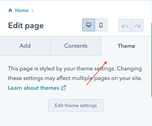
Theme settings are divided into various sections, such as Global colors, Global fonts, Website header and more. Clicking on each section lets us edit and update its corresponding settings.
Colors > Primary Color
Primary color is the main branding color of your organization
Colors > Secondary Color
Secondary color is the secondary branding color of your organization
Colors > Tertiary Color
Tertiary color is the global body color (which includes paragraphs, lists -- but not headings)
Global Fonts
Global fonts lets us choose the typography we would like to use throughout the site. Secondary font is what is used by Headings (from h1 to h6)
Website Header
This lets us control the look and feel of the site's navigation bar
Typography
We can set fonts and colors for each of our headings within this section individually
Primary Button
Lets us choose the look and feel of our primary button (used throughout the site)
Secondary Button
Lets us choose the look and feel of our secondary button (used throughout the site)
Forms
We can choose the styling of our forms within this section
Theme Variables
Certain modules within this theme utilize a generic corner radius as well as a border color. Such variables can be updated through here so that different parts of our site remain consistent.
Sections
Sections are maybe the most useful part of this theme from an editing and scalability perspective. Sections can be dragged and dropped by clicking the "plus" sign when editing a page
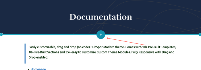
This would then open up a library of sections which we can add to our page without any additional configuration
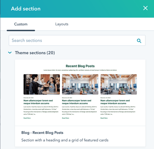
Sections can be taken as the "building blocks" of this theme which can be used to create multiple layouts throughout the site.
Modules
If we're looking to get creative, there are 25+ modules included within this theme. We can drag and drop these modules to our page to create custom layouts. These range from simple texts, buttons to full ready to use blocks (based on the use case). Most of the modules are divided into two parts.
- Content
- Styles
Content generally lets us edit and update media and text of a module, whereas the style tab provides us the options to control its look and feel.
If there are any other questions you may have, please don't hesitate to reach out to us by visiting our support page.

Testimonials
Working Together To Serve Your Needs