Theme Documentation
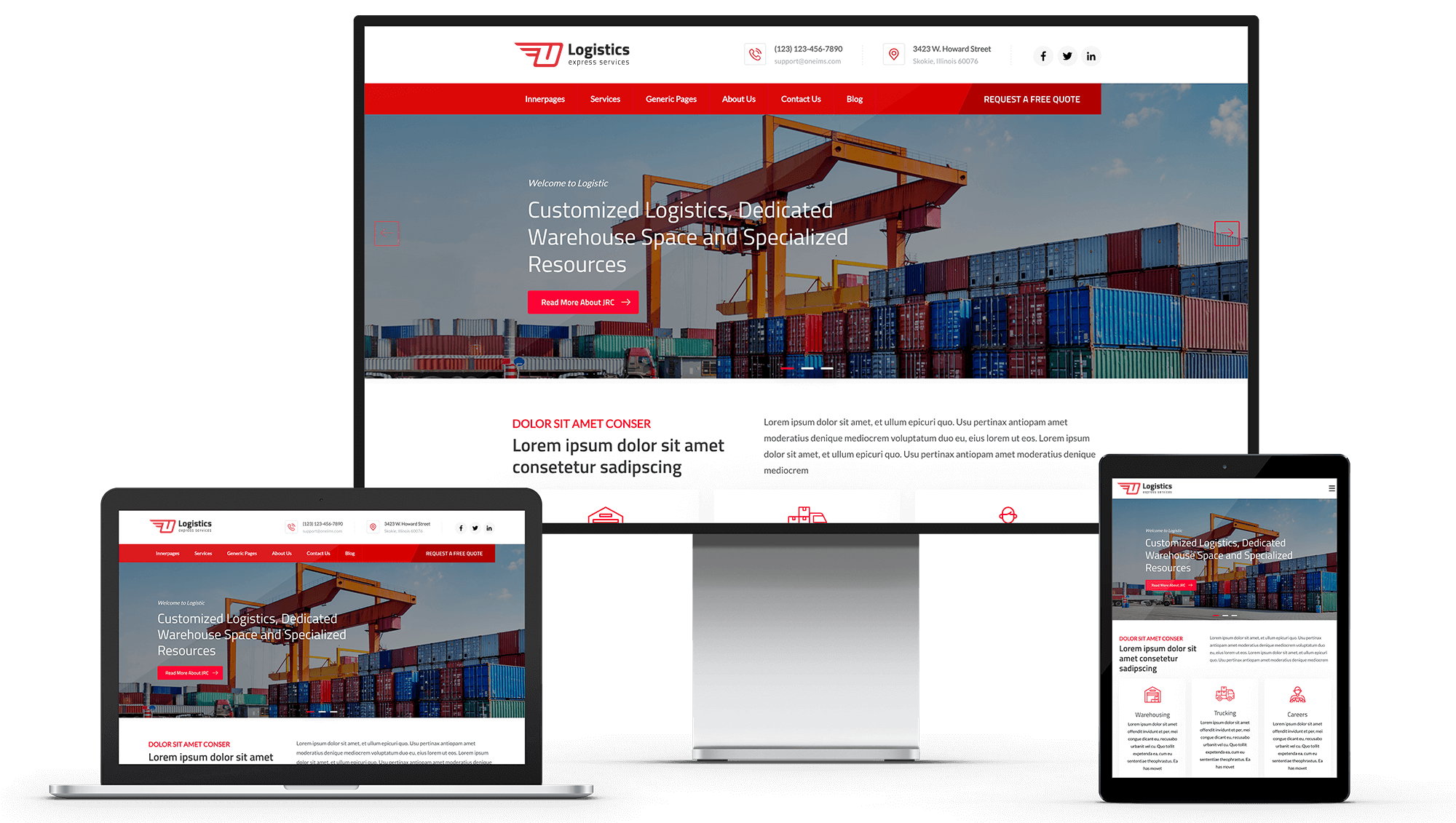
The Logistic theme is a powerful, user-friendly, and highly customizable HubSpot Drag-and-Drop theme designed specifically for logistics companies. This theme allows you to create a professional, engaging, and high-converting website with zero coding required.

Key Features:
- Fully customizable modules
- Drag-and-drop functionality
- Unlimited scroll animations
- Cross-browser and mobile optimization
- Multi-language support
- Prebuilt page templates & system pages
- Mega menu integration for improved navigation
- Customizable theme settings for branding consistency
Getting Started
Visit the HubSpot Marketplace
Navigate to the HubSpot Asset Marketplace.
Purchase and Install
- Click on "Purchase" and complete the checkout process.
- Once purchased, install the theme in your HubSpot portal.
Activate the Theme
- Navigate to your HubSpot Settings.
Navigate to Account Defaults, then select the Branding tab. From the theme options, choose the logistics theme and activate it. - https://i.imgur.com/TNV99Rs.png

Theme Settings
The theme settings allow you to modify global styles to ensure brand consistency across all pages.
In the page editor, you can see a top navigation list. There are many options listed there: you can edit theme settings, multi-language options, page clone, version history, etc.
After you update the theme settings, click on the "Publish Theme" button in the top right corner.
Editing Theme Settings
Navigate to the edit menu and then go to Theme: Logistics.
https://i.imgur.com/ofhZ703.png

Here you edit all the theme settings of the Global Colors, Global Fonts, Website Header, Typography, Primary Button Styles, Secondary Button Styles, Forms, Tables, Spacing, Footer, Blog.
Global Colors
The default branding colors are fetched from the HubSpot branding kit that you added. You can choose other colors as you wish. https://i.imgur.com/vdi9jYe.png

Global Fonts
Choose your fonts

Website Header
You can choose the menu background color, link color, and child menu border colors from here. https://i.imgur.com/4wIDMge.png

Typography
You can choose body text font, size, color, etc., heading text fonts, font, size, color, etc., and link normal and hover colors from here. The defaults are automatically set based on your global font selection and global colors. If you need something different, you can customize from here too. https://i.imgur.com/MusPbJA.png

Primary Button
The defaults are automatically set based on your global font selection and global colors. If you need something different, you can customize from here too. There are a couple of other customization options also listed here, like padding, shadow, and corner radius. https://i.imgur.com/Ubo42nC.png

Secondary Button
The defaults are automatically set based on your global font selection and global colors. If you need something different, you can customize from here too. There are a couple of other customization options also listed here, like padding, shadow, and corner radius. This button is created for an inverted button; you can choose any colors with unlimited customization like the primary button. https://i.imgur.com/C2CnUY3.png

Forms
Form's header background color, text color, form background color, form border color, form's radius, padding, form field label color, help text color, field border color, field focus color, form's button colors can be managed. The defaults are automatically set based on your global font selection and global colors. If you need something different, you can customize from here too. https://i.imgur.com/XbmjiA4.png

Tables
Table header background color, text color, body background color, body text color, footer background color, footer text color, and border colors of the table. The defaults are automatically set based on your global font selection and global colors. If you need something different, you can customize from here too.
https://i.imgur.com/VsYNc4J.png

Spacing
The width of the website container and section padding defaults are set here. You can customize it according to your preference.
https://i.imgur.com/TxvxFhh.png

Footer
The footer top portion and bottom portion background color and text color can be managed from here. The labels are mentioned. The default colors are set to dark gray; you can customize them as per your preference.
https://i.imgur.com/dRW5sDo.png

Blog
The blog header background and text colors, as well as the blog listing card size, can be managed from here. You can choose between two or three cards in a row. The blog sidebar background colors can also be updated here. The defaults are automatically set.
https://i.imgur.com/9U348Eo.png

Module Customization
All of our modules are user-friendly and include multiple customization options. They are built following HubSpot standards and are fully drag-and-drop compatible. When you edit or drag and drop a module into a page, all content settings appear in the left panel. You can easily add or edit content and styles from there. Any changes made in the left-hand sidebar will update the preview shown on the right i
Header Module
Editing Header
In the page editor, when you hover over the header, you see an orange color highlighted there. This refers to all the global modules. Click on that and click on the "Open in Global Content Editor" button.
https://i.imgur.com/WonolJd.pngn

You see many options listed in the left menu. https://i.imgur.com/TuKdgOn.png
Header logo
There are three logo fields listed here. The defaults are fetched from your branding kit. You can override the logo to upload a different one. You can also add an SVG version by checking the “Use SVGs For Logos” checkbox, which will enable you to add the SVG code. The primary logo field is for the main logo. The mobile header logo is specifically for the mobile header; it only shows on the mobile menu. The drawer logo is for the tablet and mobile; when you click the hamburger menu, there is a logo there which you can update from here.
https://i.imgur.com/DTP7Yg3.png

Module Settings
The logo's size can be managed from here. Preferably, use the aspect ratio of your logo. The desktop, mobile, and drawer logo size can be managed. Menu normal state color can be managed, and sticky menu state and hover state can be managed.
https://i.imgur.com/04GaXGE.png

Header CTA
The header CTA text and link can be managed from here. If you don't want the CTA, click "Disable CTA."
https://i.imgur.com/Ixssz6v.png

Header Contact
Header Address
Header Social
Navigation Items
The main menu can be added here. The first step navigation items will be listed in the main menu
https://i.imgur.com/O8FQ72p.png

If you need a submenu, click the edit icon in the menu, then you can see multiple options for that main menu. You can add a link to the main menu. There is a listing box asking you to choose a simple menu or a megamenu. If you choose a simple menu, it will list as a simple submenu. You can add more submenus by nesting menus using the default feature in HubSpot.


If you choose a mega menu, you can add another repeater menu labeled as mega menu items. Each item will show as one column. I have listed 3 mega menu items as default.

Each mega menu item can add an image, description, column size, and an option to enable a border between the columns. There, you can also add mega menu child items.

After making these changes, you need to publish them by locating a button at the top right corner called "Publish to Assets."
Footer Modules
Editing Footer
In the page editor, when you hover over the footer, you see an orange color highlighted there. This refers to all the global modules. Click on that and click on the "Open in Global Content Editor" button.
https://i.imgur.com/qYCmozb.png

The footer template is created using multiple modules. You can drag and drop any modules into the footer. However, we have created a couple of modules for the footer, such as “Footer Contact Info with Icons” and “Footer Label with Menu,” “Footer Social Share,” “Footer Label with Rich Text,” and “Footer Logo.”
https://i.imgur.com/rIijy7N.png

Footer Contact Info with Icons Module
This footer module has the ability to add a module that can list addresses, phone numbers, emails, etc., with icons. In the settings tab, you can enable a border between the list items. You can invert or use the actual color based on the footer background color. The Animation tab allows you to choose from more than 95 animation styles we have added.
https://i.imgur.com/YGhK8uD.png

Footer - Label with Menu
You can add a simple menu with a heading. In the settings tab, you can adjust the margin and text color. The Animation tab allows you to choose from more than 95 animation styles we have added.
https://i.imgur.com/wE18hYQ.png

Copyright and social media icons
You can see static modules listed in the contents panel. This section has the copyright and social share icons. These items can be updated from here.
https://i.imgur.com/TVbC3Dh.png
https://i.imgur.com/CbEMpbG.png
https://i.imgur.com/IejWZ2E.png


Other Theme Modules
Home Page Hero Slider
This module is designed for creating a hero slider. The sliders tab is created based on Repeater Fields, which are nested subfields that provide flexibility to add, edit, or delete items from a list. Each slider has an option to add a top title, heading, description (in rich text or simple text), button, and image or video as background. You can use solid or gradient colors as the background and overlay the colors for the image or video as well. You can enable or disable text shadow, and you can decide the heading and content width with an option to center the text container.
https://i.imgur.com/015vH2N.png

The Padding tab lets you adjust padding, while the Settings tab allows you to invert colors. The Animation tab allows you to choose from more than 95 animation styles we have added.
https://i.imgur.com/RTLRTxz.png

Customizable Heading and Content
This module is designed for creating custom content. In the content tab, there is an option to add a top title, heading, subtitle, and description (in rich text). In the settings tab, you can enable color, alignment, width, font-weight, heading tag, size, etc. You can choose a custom color by selecting theme color as custom. The Animation tab allows you to choose from more than 95 animation styles we have added.
https://i.imgur.com/K9eiEeO.png

Simple Content
This module is designed for rich text content only. In the content tab, there is an option to add rich text. In the settings tab, you can invert color, alignment, and width. You can choose a custom color by selecting the theme color as custom. The Animation tab allows you to choose from more than 95 animation styles we have added.
https://i.imgur.com/zOlXIMg.png

Card With Full Image or Icon
This module is designed for displaying card content with an icon or image. It allows you to add a heading, description (in rich text or simple text), and a button. If you do not want a button on the card, simply leave the button text field empty. You can also add an icon or an image. If you choose an icon, you can select the icon type as either SVG code or PNG format.
In the Typography tab, you can customize the heading size, weight, and color. In the Settings tab, you can adjust the padding, border, corner radius, background color, icon size, button text color, button background color, and hover state colors for the button. The Enable Arrow checkbox lets you enable or disable an arrow inside the button. The Animation tab includes over 95 animation styles to enhance the visual experience.
https://i.imgur.com/2VnFlwJ.png

Styled Button
This module is designed for creating custom-styled buttons. You can add button text and specify a destination.
In the Settings tab, you can adjust the text alignment, button alignment, and button type. You can also enable full-width button mode. The Override Default Button Styles option allows you to customize the button's colors for different states. Additionally, you can modify the corner radius and border width.
The Enable Arrow checkbox lets you add or remove an arrow inside the button, while the Enable Box Shadow on Hover option applies a shadow effect when the button is hovered over.
The Animation tab offers over 95 animation styles to enhance the visual experience.
https://i.imgur.com/4VjGyDH.png

Customizable Media
This module is designed for creating customizable media. You can add an image or use an image as a video thumbnail.
If you select "No Video" as the video type, the module will function as an image module with animation. If you choose YouTube or Vimeo as the video type, you need to provide the video ID, which will display the video in a popup.
In the Settings tab, you can adjust the button alignment, image/thumbnail size, image width and height, border radius, and auto margin.
The Animation tab offers over 95 animation styles to enhance the visual experience.
https://i.imgur.com/UNEyHrX.png

Styled list
This module is designed for creating custom list styles. You can add list content using repeater fields. Each field allows you to include both bold text and normal text.
The Animation tab offers over 95 animation styles to enhance the visual experience.
https://i.imgur.com/3YjrR3P.png

Card With Icon
This module is designed for displaying card content with an icon, allowing you to add a heading and description (in rich text or simple text) and an icon in PNG, SVG, or HubSpot icon font format. In the Typography tab, you can customize the heading size, weight, and color, while the Settings tab lets you adjust the padding, card alignment, border, corner radius, and enable Override Card Color for more customization options; additionally, the Animationtab includes over 95 animation styles to enhance the visual experience.
https://i.imgur.com/pqg8bhM.png

Counter Section
This module is designed for displaying a numbers counting section, which can showcase completed achievements, counts, etc. You can add a background image or video, apply a tint or gradient colors, and include a heading and content; in the Counter Repeater section, you can add a counter title, counting numbers, and an icon, while the Settings tab allows you to invert text color, adjust content max width, and modify padding.
https://i.imgur.com/fAofxof.png

Global Team Carousal
This module is designed for displaying team cards. In the Team Cards Repeater field, you can add a team thumbnail, name, designation, and social account links. In the Settings tab, you can invert text color, customize the card background color, border radius, border width, and card alignment.
https://i.imgur.com/ZTEDPnZ.png

Global Testimonials
This module is designed for displaying testimonials. In the Testimonials Repeater field, you can add a thumbnail, name, and title. In the Settings tab, you can invert text color and customize the card background color, border radius, border width, and card alignment.
https://i.imgur.com/rhfl2r2.png

Inner Page Hero Banner
This module is designed for creating a hero banner. It includes options to add a heading, content, button, and an image or video as the background. You can use solid or gradient colors as the background and apply an overlay for images or videos. Additionally, you can enable or disable text shadow.
In the Settings tab, you can adjust the heading and content width, choose to center the text container alignment, invert text color, and modify padding for further customization.
https://i.imgur.com/Mp63SK1.png

Team Card
This module is designed for displaying team cards. You can add a team thumbnail, heading, title, content, and social account links.
In the Settings tab, you can invert text color, adjust the border width, card radius, border color, and card alignment. The Animation tab includes over 95 animation styles to enhance the visual experience.
https://i.imgur.com/4PBDFYE.png

Accordion
This module is designed for displaying an accordion. In the Repeater field, you can add a heading and content, which can be repeated as needed.
In the Settings tab, you can invert text color and adjust the box shadow. The Animation tab includes over 95 animation styles to enhance the visual experience.
https://i.imgur.com/ipQfqQH.png

Testimonial With Image
This module is designed for displaying individual testimonials as quotes. You can add a thumbnail, the person's name, and their title.
In the Settings tab, you can customize the padding, border, border radius, border color, and background color. Enabling Render Inverted Comma will display a quote icon, while Enable Box Shadow will add a shadow effect to the card.
In the Image tab, you can adjust the image height, border radius, and position. The Typography tab allows you to modify the heading size, weight, and color, as well as the name and title size and color.
https://i.imgur.com/SnvWctJ.png

Global Partners Slider
This module is designed for displaying logos. In the Repeater field, you can add a logo. In the Settings tab, you can enable autoplay and adjust the logo width and slider width.
https://i.imgur.com/pmEZQZv.png

Global Banner CTA
This module is designed for a Global CTA Banner. You can add a heading, subtitle, button, and image. For the background, you can apply solid or gradient colors, and the image position can be set within the module. In the Settings tab, you can invert text color
https://i.imgur.com/0t1Pa7Z.png

Boxed Form
This module is designed for forms, allowing you to add a heading, content, and form.
In the Settings tab, you can invert text color, adjust padding, text alignment, background color, form box border, box shadow, border radius, heading max width, and content max width. The Animation tab includes over 95 animation styles to enhance the visual experience.
https://i.imgur.com/zYkKWvV.png

Global Blog Sidebar
You can choose which blog to render for recent posts. If you enable the Render Search checkbox, a blog search box will appear in the sidebar.
In the Recent Posts tab, you can adjust the heading, post count, and enable or disable the recent posts sidebar.
The Categories tab allows you to enable or disable category tabs in the sidebar using the Render Category checkbox, and the category heading can also be customized.
Additionally, you can enable or disable the subscription form using a checkbox, and its heading is customizable. By default, all these fields are enabled.
https://i.imgur.com/1sN6n1c.png

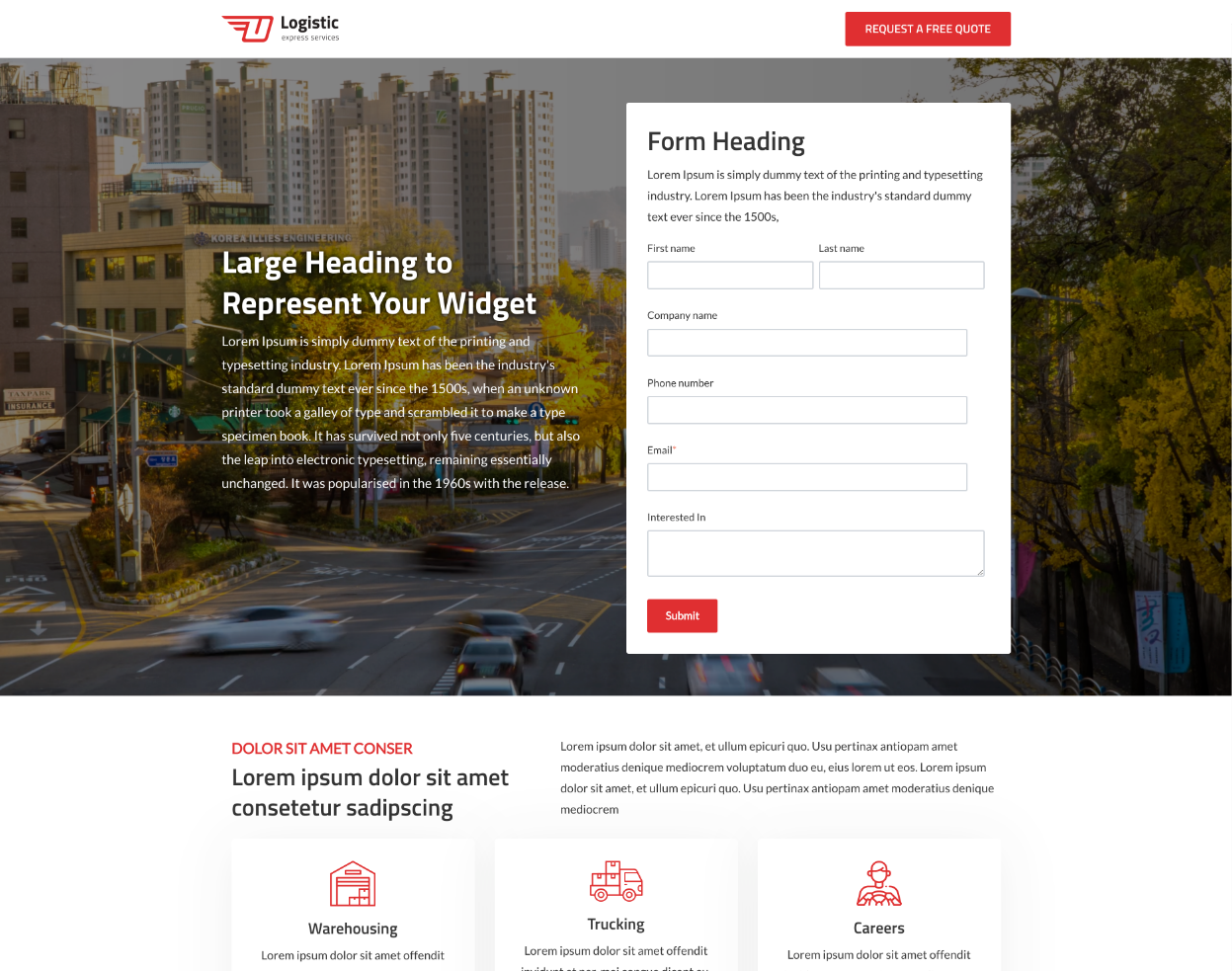
Landing Page Banner with Form
This module is designed for creating a hero banner with a form. It includes options to add a heading, content, button, and an image or video as the background. You can use solid or gradient colors as the background and apply an overlay for images or videos. Additionally, you can enable or disable text shadow.
In the Form tab, you can add a form heading and content, choose the form, and, if needed, invert the form text color.
In the Settings tab, you can invert the banner text color, adjust vertical alignment, and modify padding for further customization. The Animation tab includes over 95 animation styles to enhance the visual experience.
https://i.imgur.com/KzBLqtV.jpeg

Sections
We have created 18 section templates based on the theme layout. You can import a section template into any page and position.
To do this, click the plus icon on the left side of the page editor, where you'll find all the section templates. Simply drag and drop the desired section onto the page.
https://i.imgur.com/bgCpL0D.png

Prebuilt Page Templates
Our pre-built page templates make it easy for the everyday growth marketer to create an impactful website easily and quickly. From the home page to the blog listing page, our comprehensive collection of pre-built templates offer everything you need.

Home Page

Services Page

Innerpage Layout One

Innerpage Layout Two

Innerpage Layout Three

Innerpage Layout Four

About

Our Team

Landing Page

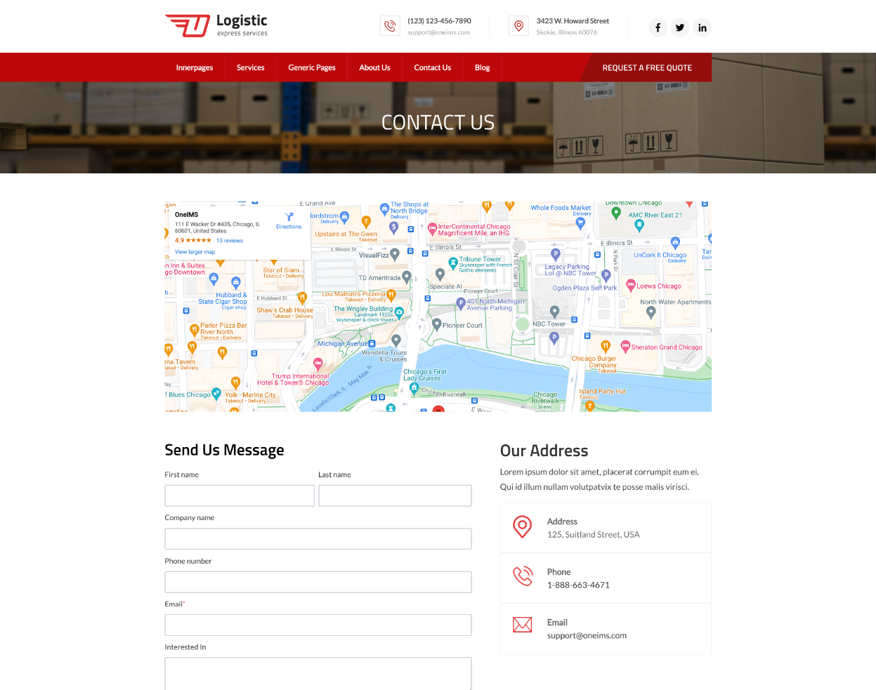
Contact Us

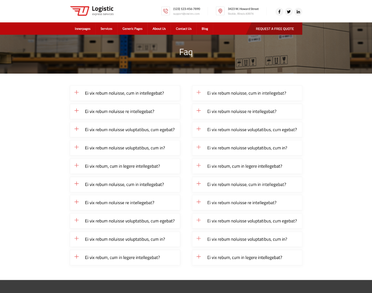
Faq

Generic Page

Blog Overview One

Blog Overview Two

Blog Single One

Blog Single Two
Cross-Browser Optimized
No matter what browser your customers and partners use, our FinTech theme provides an optimal experience on Chrome, Firefox, Safari, and Edge.

Layout Types
Create different layouts to create a website that perfectly fits your brand and allow you to optimally organize all of the valuable content you want to convey to your potential customers.
28 Modules
Build Anything You Want
With 22 easy-to-use, customizable modules, you have the ability to build your website any way you choose.


